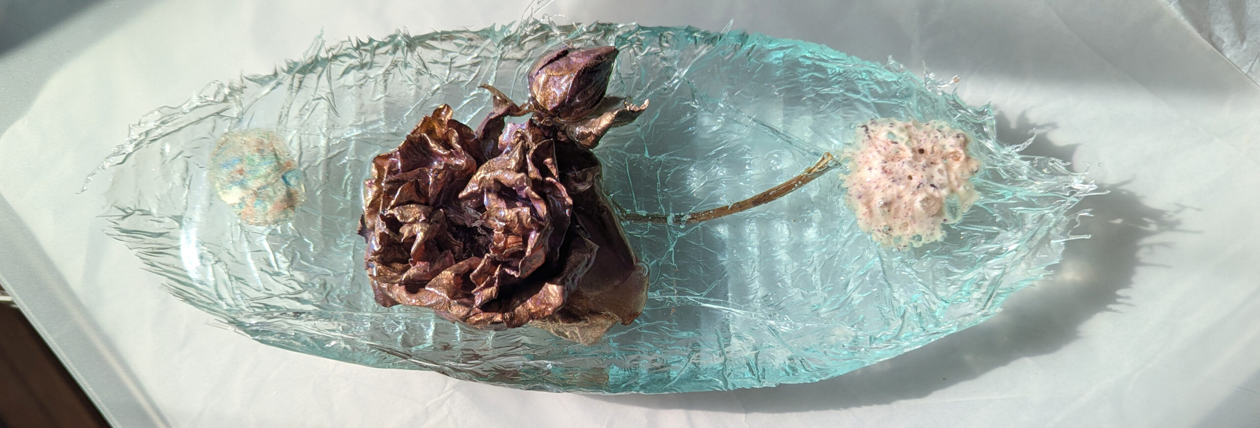
I have not been near a printing press for several years now, having sold my small home press and dropped my membership in the local printmakers’ guild, Corvidae Press. But I have a few incomplete prints I have saved to work on, including this edition of a polylitho “drawing”. These are single pass, single ink images that I hand color in various different ways. The result being several unique artworks based on one print edition, most being colored pencil on a polylitho print. I did use some watercolor and pen on a few prints.
The top row is the very latest one, with soft pastel coloring completed today, followed by two foiled versions of the same colored print. The lower row shows the same print before much of the color was added, followed by a digitally foiled version. The last image is a digital foil of another variant, also colored, but not shown here in the “flesh” original.
I can’t help having a few further thoughts about the label & word: macabre. It is a fine word, but … making artwork that displays the sad and weary does not equal macabre!
I incorporate real life, and sometimes my work shoes anger, sadness, even despair. But also hope, beauty and joy.
Of course if documenting and displaying the existence of death in life is macabre, well so be it.
An entertaining article, spun from a series of written interview questions, identifies me as a macabre artist! I find I rather like the term, at least at the moment. Certainly some of my favorite artworks do border on the macabre, and maybe some people find them so. Of course I have created any number of pieces that do not fit that description at all. So am I a macabre artist?
You can find the article on a site named Obsessed with Art, which features various artists willing to respond to their interview questions. I am very pleased to be featured, and I enjoyed reading this article. Of course I immediately wanted to edit and improve my own responses to their questions, but it is late for that now! I am left with is this question: am I a macabre artist?
Of course I want to argue the point! For one thing, I am naturally argumentative! And for another, I have read various definitions of “macabre”. Here is the Merriam Webster definition, with three meanings for this adjective:
Definition of macabre
1 : having death as a subject : comprising or including a personalized representation of death: The macabre dance included aprocession of skeletons. 2 : dwelling on the gruesome a macabre presentation of a tragic story 3 : tending to produce horror in a beholder this macabre procession of starving peasants
I may not be the best judge of my own work. When I look at the pieces I choose to display at home, I see variety. I don’t necessarily find a recognizable style, only the works that I recognize as my own. But I do see themes that recur, some over and over through many years: bones, distortion, mystery, fantasy, and perhaps a sense that something is not quite right. And yes, death is a recurring theme in my art. But does that make my work macabre? Yes and no. Other themes that recur include family, birds, trees, and beauty in nature.
Certainly in the narrower sense of the first Merriam Webster meaning, the answer can be “yes”.
Examples of Death in my Work
Work about Life
However in the second and third meanings that are the focus of this statement in Wikipedia, I would answer with a resounding “no!”. My work is not obsessed with death, does not focus on the gruesome, and plenty of it is about life!
Less Macabre Examples!
In works of art, the adjective macabre means “having the quality of having a grim or ghastly atmosphere”. The macabre works to emphasize the details and symbols of death. The term also refers to works particularly gruesome in nature.
I do not think that the term “macabre” is an adequate description of me as an artist, but I can certainly enjoy this view of me and my work! And I embrace the term based on the narrow definition that death is a subject in some quantity of my work. A lot more of my work than I realized can be thought to reference death. For one thing, angels do make a lot of appearances. Although I don’t think of my angels as about death: for me, angels are symbols or personifications of protection, defense, assistance, or love.
So as a description, the term “macabre artist” is certainly incomplete.
So again I ask you the question: am I a macabre artist?
Take a look at this short article at Obsessed with Art; it makes for fun reading. But then look at my online gallery, and decide for yourself just how macabre my work is!
I had limited energy for Halloween, but did manage a few last minute decorations. Unfortunately I have still failed to accept the shift to non-spooky daylight Halloween activities, so all my spooky decorations went unappreciated…
In addition to my Halloween fun, digital foiling has resumed for the winter … as if it ever really stopped!
My experiment with printing from an engraved found metal “plate” resulted in two very light “ghost” prints. My printing plate is 3/4″ thick and is 22″ x 30″, so I could not print on my small home press. Instead I hand rubbed and rolled to my thick soft paper.
The result was very uneven on the two prints I made. I had the full image, but both very dull and unfinished in appearance. I worked on them both, then set one aside still incomplete. I have done more work on this now, and I have more color on a ghost print of the dancer who continues to appears in my art periodically.
Progress
And More Color
Maybe this is the eternal dancer who creates the world and the tree of life. Or maybe this is just a naked soul who dances for joy. The fantastic tree full of many colors and patterns reflects the many moods and many variations in our lives.
Each variation of my Three Angels requires more than a little creative thinking, not to mention a good bit of work. And as for the angelic display logistics! Oh my!
My first, and so far only, cement version of the Three Angels Is quite thin, and therefore especially susceptible to being damaged. I want to display outside, but it needs to be safely secured. If it falls or is dropped on a hard surface it will almost certainly chip, and might be damaged beyond reasonable repair.
I have created a rudimentary stand for it now; one that is far from elegant, but fairly discreet. It neither enhances nor detracts from the artwork, I think. And that is sufficient angelic display logistics for this week!
My Three Angels are mounted now, and ready to go! My clear resin Three Angels / Purple Mountains is complete, and in search of a new long term home!
This artwork will look best in a room with multiple lights sources and windows. The background and the figures seem to come to life when the light is right, and I love the variation a different light angle and intensity can bring to this piece.
The resin relief cast is “pegged” to the wooden panel at the four corners, using clear acrylic rod and epoxy super glue. The panel edges are painted and I will add D-rings & picture wire for hanging later today. This mixed media piece has been a bit complicated to assemble, but now it is satisfactorily complete!
And now that my Three Angels / Purple Mountains is complete, I would really like to sell it. However I have not been able to even begin to set a price. Maybe after I recover from all the hours of work!
The tiny LED rice lights are just tucked in between the resin cast & the back. The tiny switch and battery “box” is installed into a pocket behind. These are pretty discreet when turned off, but removing them is easy if they not wanted. However care must be taken not to scratch the surface of the paper background if they are to be re-inserted!
When I decided that a pastel drawing I created in 2017 would make a perfect background for a clear resin cast of my Three Angels relief sculpture, I made a lot of work for myself! I realized that I need Purple Mountains alone and for Three Angels.
I located and ordered a package of cradled birch panels for my project, and prepared one by mixing and painting the edges the perfect silvery gray. Then I mounted the original drawing carefully to create a background for my angels. That is when I decided that I needed to have it both ways! I like the decorative original drawing more when so carefully presented, but the resin piece is perfect when placed over it.
So now I do have it both ways, several days, and many hours of work later. I used my meticulously merged four part scan of the 24″ x 18″ original drawing for a good quality print. And I have mounted the print onto a second birch panel, and carefully placed prints of digitally enhanced photos of each figure. It is now ready for my Three Angels. The original mounted drawing is designated as a housewarming gift. It is bubbled wrapped and ready for transportation to a new home.
I am still waiting for an order of short acrylic rods that I will use to make shorter pegs. When I have cut and smoothed these I will drill holes in my resin cast and in the cradled board, then use the pegs with epoxy glue to mount the resin cast to the panel with the angel figures shown above (bottom right).
Second clear resin cast of Three Angels
Cast placed in front of the intended background
The pastel of Purple Mountains looks so nice mounted on the cradled panel, with the edges in silvery grey. And the clear resin relief comes to a fuller life with a rich background. The depth of the resin and the relief figures still transform as the light changes. With the mountain background and the printed figures, the effect is rich and vibrant even in the brightest light. Soon I will have my Purple Mountains alone and for Three Angels completed.
After the initial creation of my various mixed media pieces, there is often a new challenge. How will I display this new artwork? Few of my recent pieces can or should be displayed in picture frames! But I do have plans now for an angelic display or two. In fact resin #1 is ready!
The first of my two clear resin versions of “Three Angels: The Mediation” is now installed for display. I have it hung in a window where the light shines through, using simple system of picture wire.
The second clear resin version of “Three Angels” will soon be mounted on an opaque background. I found the perfect background: a 24″x18″ pastel drawing of trees and purple mountains, completed a few years ago I ordered a cradled board to support the paper and resin for hanging. And I will mount digital enhanced photos of the three angels immediately behind each figure to make them more “solid”. The background scenery is misty and muted by the textured and tinted “clear” resin. The result is a wonderfully mysterious environment.
First resin cast is on the left, and the second resin will be permanently mounted on a cradled board, using the background shown on the right.
Visitors staying in my newly refurbished guest room will be able to enjoy an angelic display during their visit, at least until this piece finds a new home. Now that I have a way to display it, it is available. The price will be very affordable if I can make a direct sale, but I will have to add a big markup if I have to try to sell via Saatchi online or elsewhere. Please contact me if you would like to see either of these works.
A little play on words here, for those who know the phrase “Have you heard the good news?”. Well my Three Angels have good news: the improved extended silicone mold worked like a charm! My efforts paid off, now the mold is whole, and does not leak!
So I made a third cast, the second one in clear resin. Now it is out of the mold, and it looks good! In a few more days it will cure hard and be ready to go. It is thinner than I would prefer, but really I am very happy with it. I like the pigments in the side two figures, and the center figure coloring is better. I don’t see any flaws, although I have not inspected for minute bubbles, etc. yet. No need to dull my pleasure yet!
The second clear resin cast: at left you see the glossy flat “back” side, with the cast still in the mold. At right, the relief “front”, released from the mold.
Comparing Two Casts:
First resin cast, Three Angels: The Mediation, earth tone pigment in clear resin.
I think this piece evokes a quite different feel than the first clear resin cast, which was such a problem to complete! My new cast has a cooler, somewhat ethereal feel. This is in contrast to the more substantial strong earth tones used in the first clear resin cast of my piece.
I include this photo of the first earth toned cast for comparison. The overall coloring is darker, and the red ochre against the greens dominates a bit, but I really love the dark beseeching angel on the right in this cast.
For the new cast (in the first two photos) I avoided the green tones used in the first resin in favor of a brown earth, and I chose to emphasis the leftmost figure with gold. I defined my center figure with black outlines and pearlescent highlights, so only a hint of color. The stronger most skeletal figure on the right has a metallic lavender sheen, and is boldly accentuated with black. Did I get carried away with the lavender? Maybe…
Now I am working on a cement cast, for an opaque version that will be durable out of doors. Photos soon!
More Details:
The casts, like the original piece, are 24″ x 18″. The clear resin casts are lightweight, and can be presented/displayed to be viewed from both sides. The relief side is textured, and more or less matte finish, while the flat surface on the reverse side is glossy. I made the first cast of this work in tinted opaque white plaster, so it is single sided, and is very heavy.
Update
This work is now available in cement suitable for installation outside! I have one cement cast made, with rather intense color! And I plan two more cement casts. The next cement versions will likely have more subdued earth toned pigments, unless I get a commission for something vivid!