
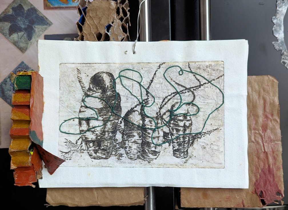
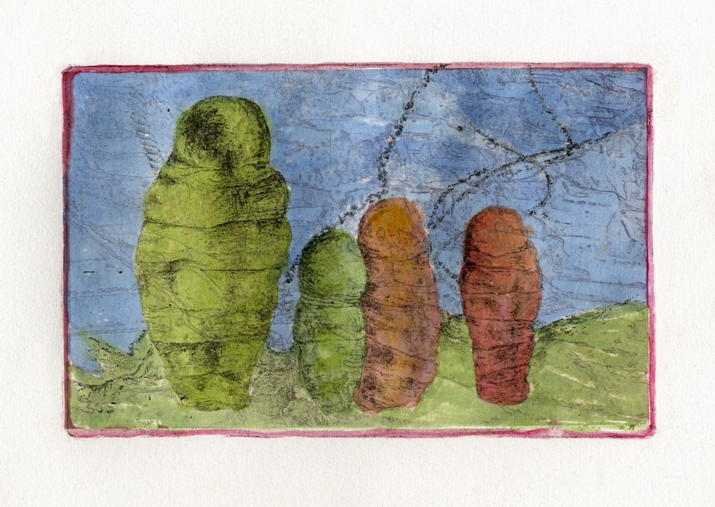
These bound and wrapped mummies are a chine colle photo etched print with string, mounted on honeycomb cardboard packing material.

I have reworked/completed three more older prints: “Fire on the Mountain”, “Fire on the Beach”, and “Fire at Sea”.
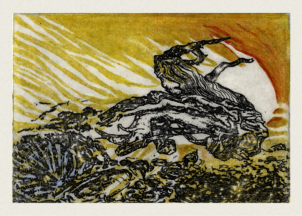
All three started out as hand pulled prints, originally printed at Corvidae Press in Ft. Worden State Park. The first is a monoprint using stencils. Fire on the Beach was printed using two plates: a linocut and a solar plate. I think that Fire at Sea is a linocut printed twice, flipped!
I suppose that wildfire and chaos are very much on my mind!
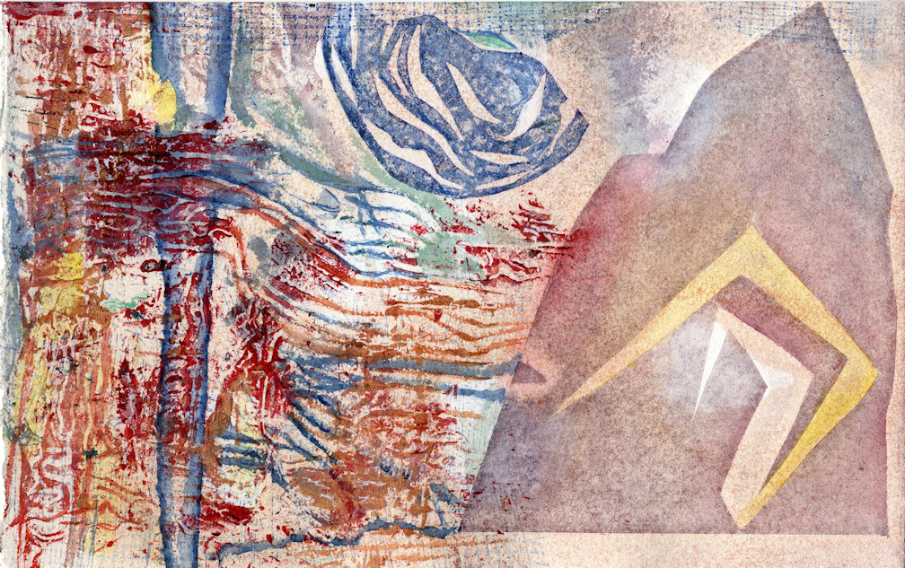
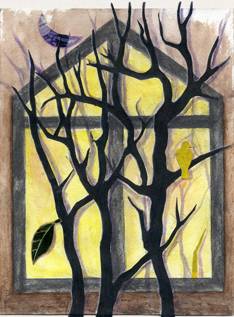
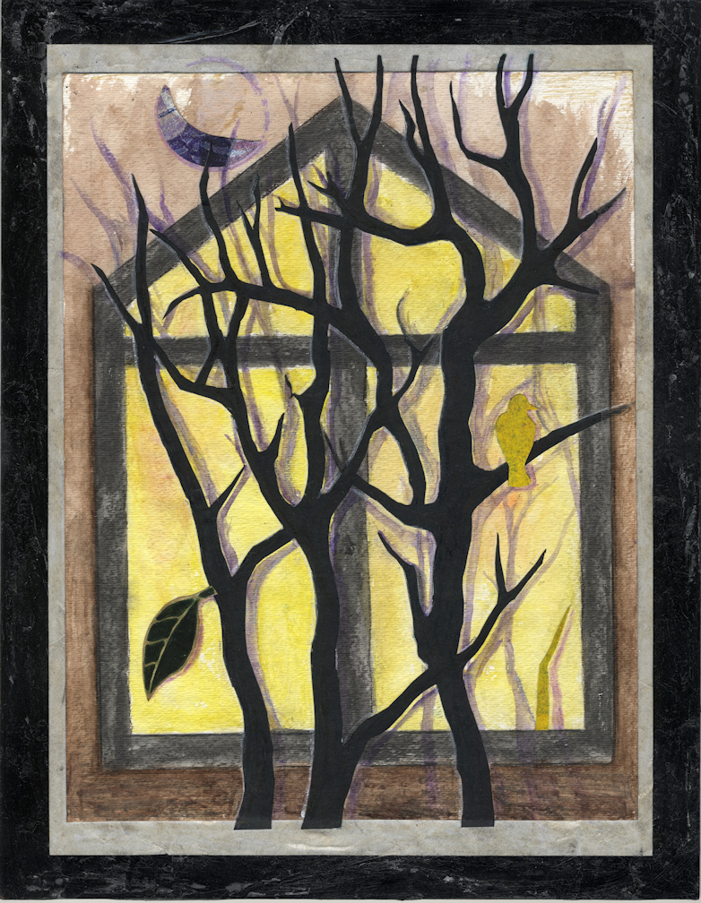
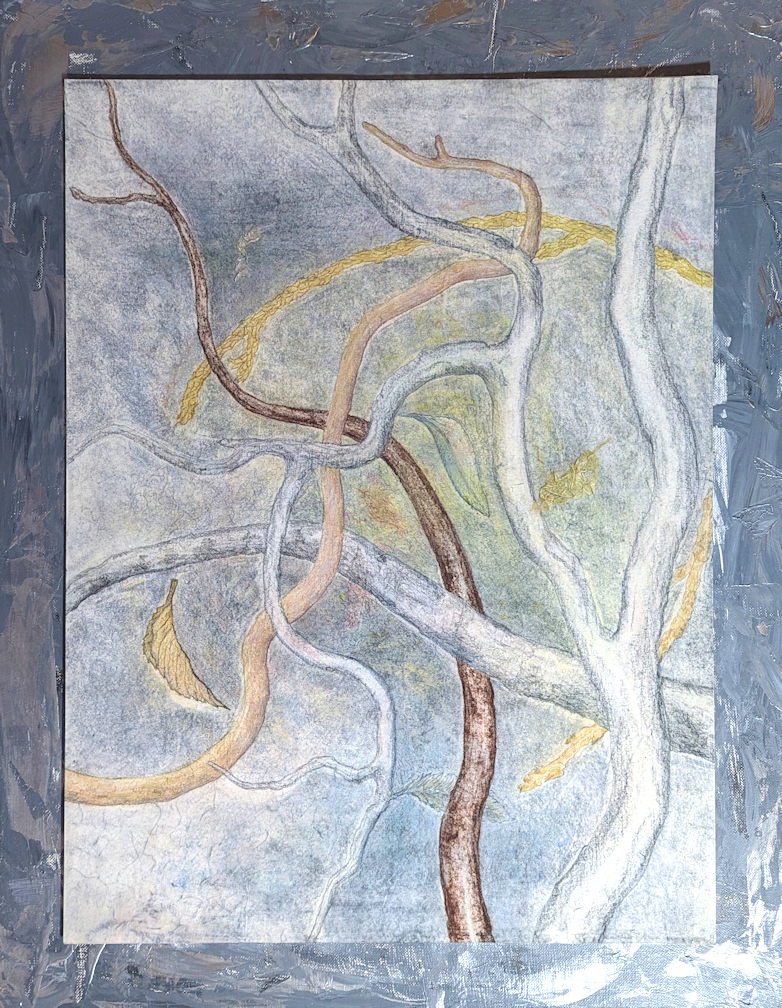
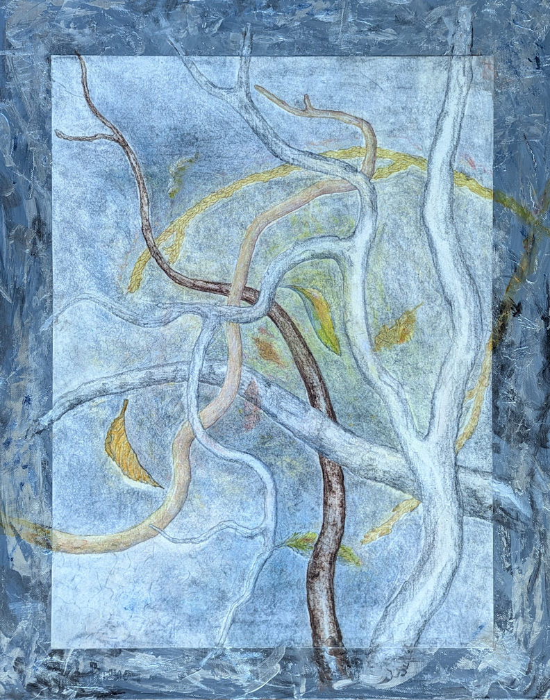
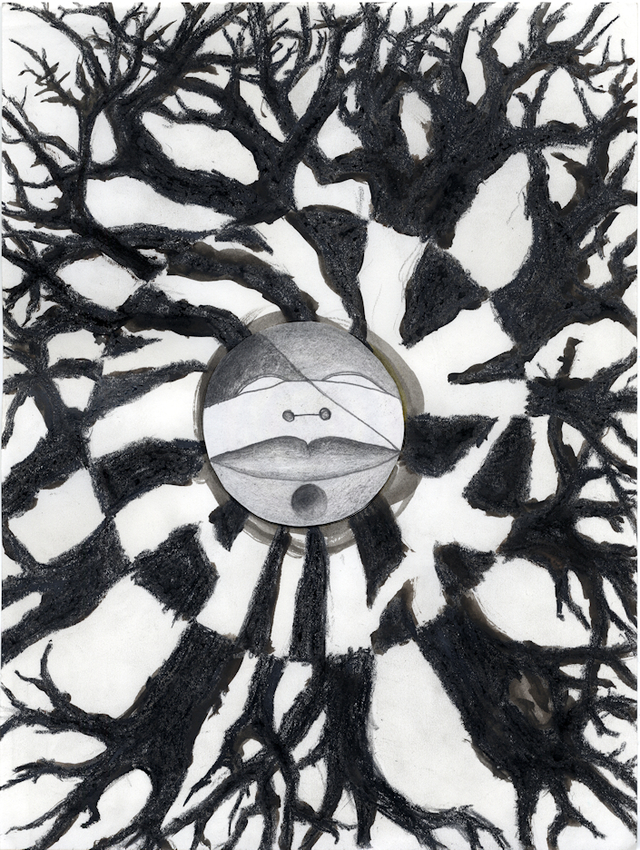
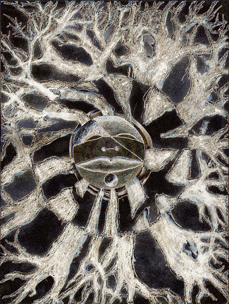
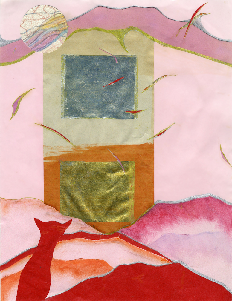
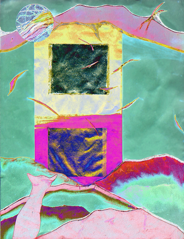
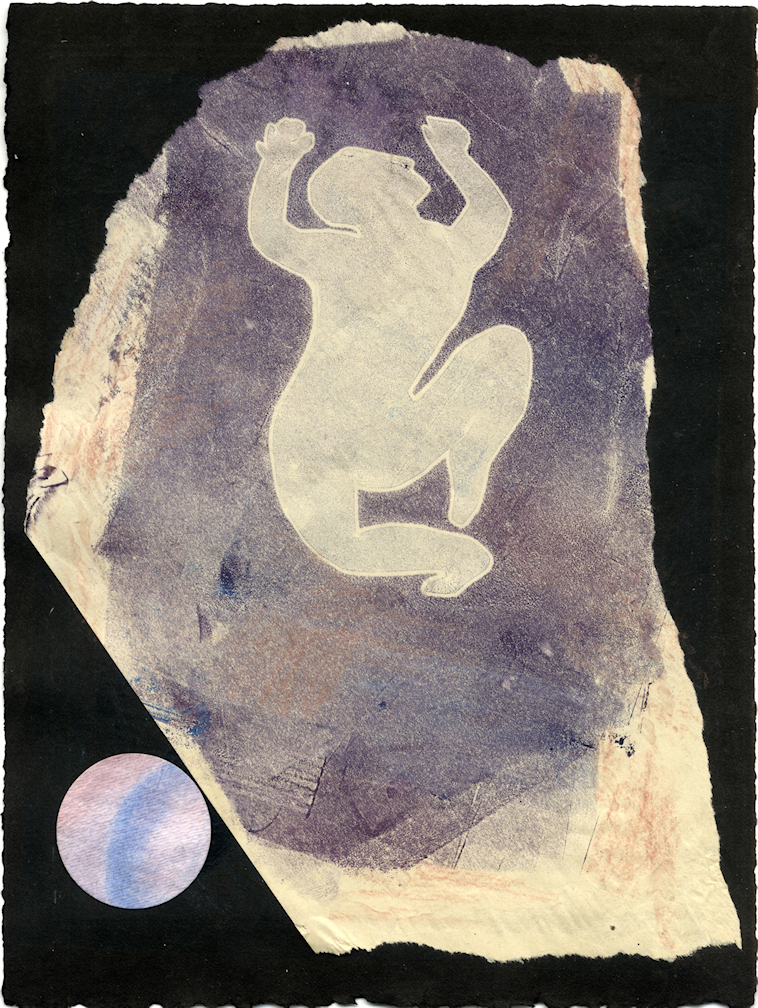
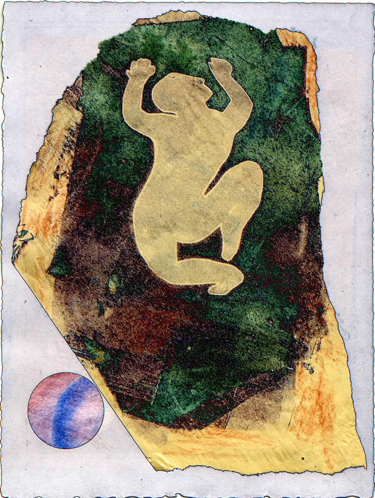
Here is another artwork that I started long ago, now completed by adding collage elements. The images left to right: the early version, the new version, and then the final mounting:
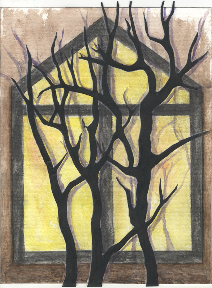
I am afraid that the earlier version was already sufficient. It consisted of the watercolor window with cutout trees superimposed, with the tracing of purple shadow painted in.
I may well have cluttered and spoiled it by adding the newest elements: a leaf, a bird, and a crescent moon. But it is done, and now the work is mounted on a chipboard panel eady to hang.
I am currently very discouraged about most of my artwork, so I will put this away and hope that I will like it again later! Wouldn’t it be lovely if someone wanted this. But really that is not very likely. I am doing no marketing here. Although I did sign up for the August studio tour, so maybe I will sell a few pieces then.
Most of the time I start work without much of a plan, and this mixed media painting is no exception! I started work using watercolors over a found background on a 16″x20″ canvas board. The four images below are progressive stages/drafts of this piece. The fiery end result evolved from the simplistic ghostly dead trees you see below to a chaotic inferno in red and gold with floating embers, leaves, and feathers. I took a couple of days to determine that this piece would be a response to wildfires in & around Los Angeles this January.
I can’t say that I like the painting, but perhaps it was a necessary exercise. The increasing number of unmanageable wildfires large neighborhoods and small towns is not something any of us should be able to ignore.
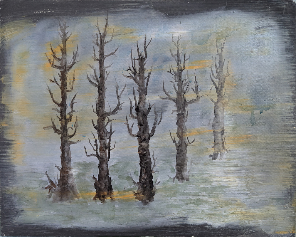
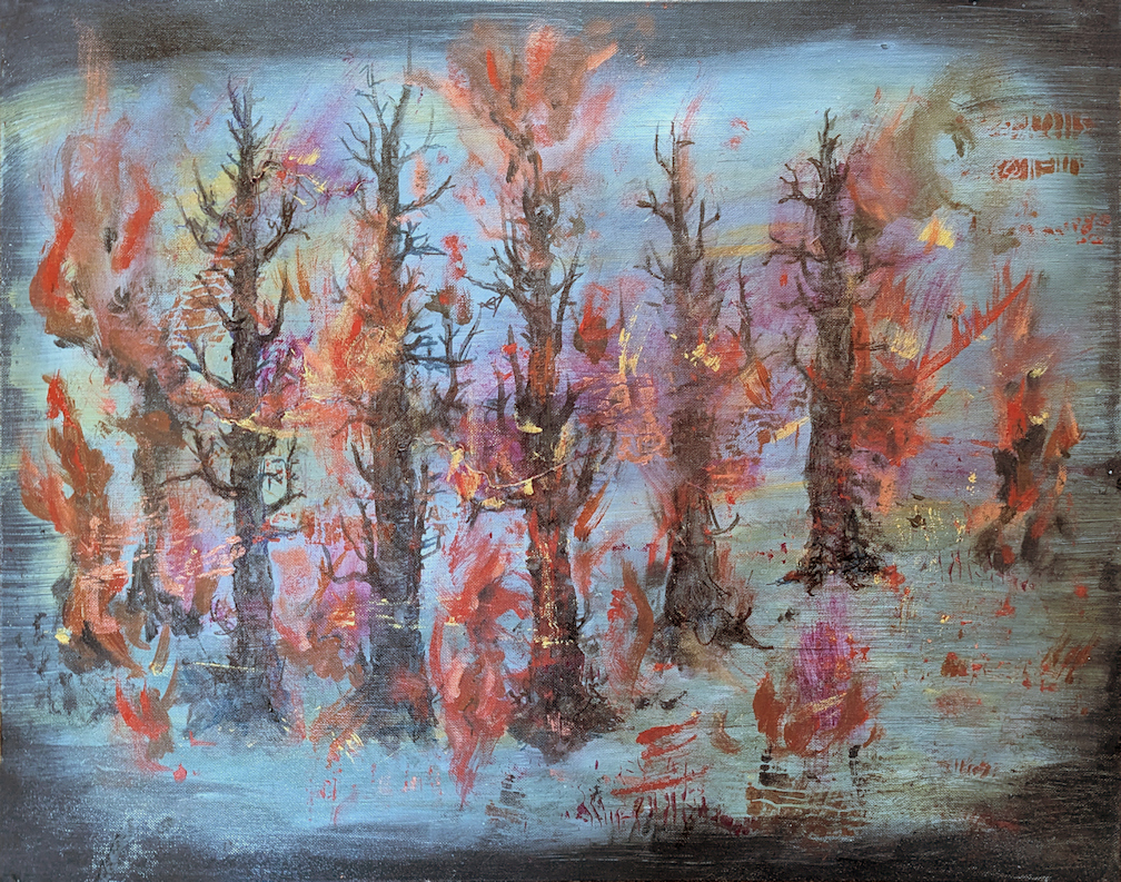

As usual with larger artwork that I photograph rather than scanning, the pictures are all taken with different lighting. Dark edges and grey background are actually the same color in all four drafts above, although there is less and of the original grey visible. I think some photos were taken in natural daylight, some with a mix artificial and daylight at various times of day… of course this makes the colors look quite different.
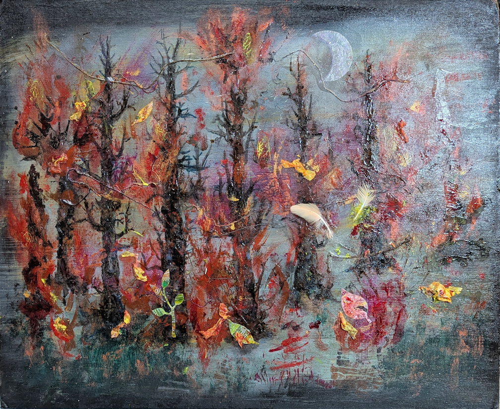
“When Water isn’t Enough” has difficult subject matter, and the result is a very dark piece of work. It is most certainly a response to wildfires that are an increasing threat to us all.
How can the tiny fragments of greenery survive the fires? What about the animals and the birds? The moon will shine on regardless.
I have been taught about the value of presentation. A fabulous painting or lovely drawing will be better “seen” by others if it well presented. This may mean framing, or I may choose mounting for presentation. Mounting an artwork to a board or panel may be more appropriate. I don’t want my work behind glass, and framing is a lot of overhead for an artist. Professional framing is expensive, and do it yourself framing requires skill, time, and tools.
With some drawings and paintings I mount the original work directly on a board or a panel. If it is on paper, I will seal it with acrylic medium or wax. This is not archival, but I am not making great art for posterity. The surface will be delicate/fragile, but so what? Art will be hung up for viewing, not handled daily like a toy or a tool! It will be up to the owners to care for it as they see fit.
When I mount archival prints of my work, I may not resist the urge to enhance them. Even a very good print will not have the impact of the original work if the original has dimensional impasto or collage elements. So when I mount an archival print, I may do a bit more to improve the presentation. Here is one example:
You can see on the left the archival print, just positioned on the painted canvas board prior to mounting. At right is the mounted print with enhancements. Note that I took the photos in different lighting so the colors appear different. Really the overall colors are much the same.
What is different: I added a tiny hint of dimension to the print, using acrylic medium & translucent color. I added to the leaves and another spot where the original work has dimension. The main change was is on the mounting panel: I extended a hint of the branches out beyond the print. This felt necessary because I mounted the print on a larger panel, so the background distracted me from the actual print. I like it better with this additional level of presentation. It is not just a weaker copy of the original, but something a bit different and new.
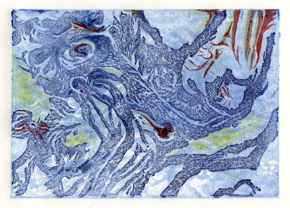
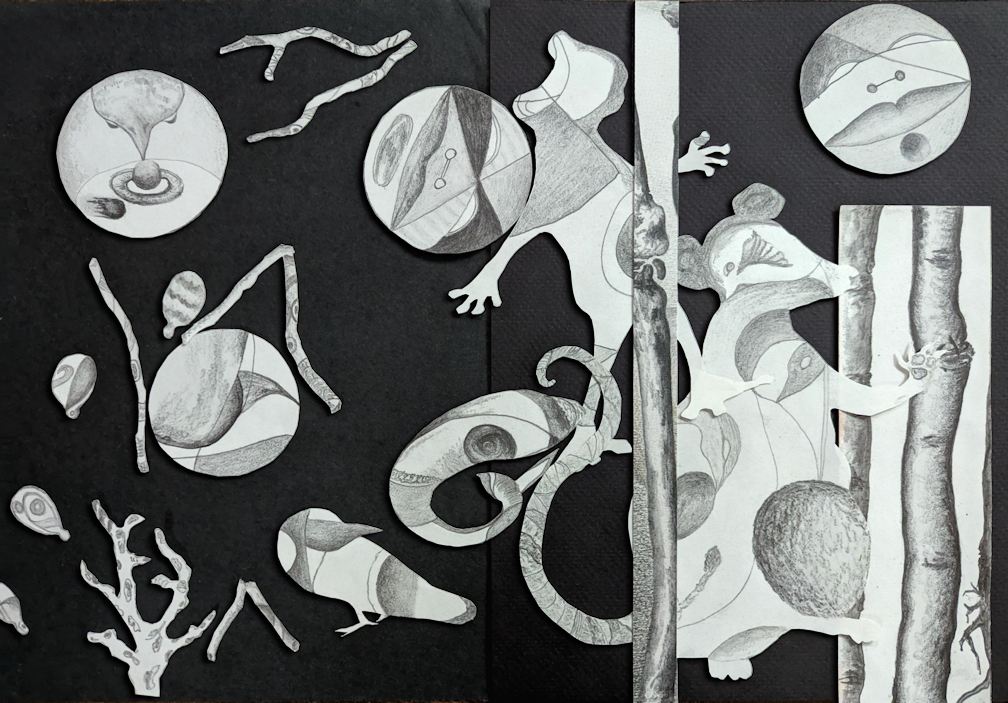
It is time for a bit more collage fun with some older elements retrieved from my flat files! I found some drawings already cut out, then stashed away. Note also one more mummy print now updated with watercolors. And of course I have to scan these and tryout some digital variations, so the right hand images have digital enhancement.
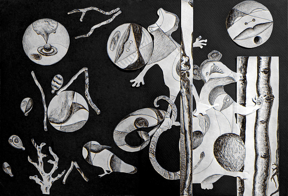
I like using ghost prints. I often made a ghost print back in my printmaking days, unless I was printing an edition. And that was infrequent as I preferred the variety of unique prints.
A ghost print is the second or even third image pulled from the plate without re-inking. Sometimes, very occasionally, a ghost print will be spectacular; better than the first, intentional print. But more often the ghost print will be pale and a bit lackluster, but still with some value.
Ghost prints can be excellent backgrounds for additional work. An intricate ghost print provides a fine start for abstract doodling with colored pencil, pen, or even paint. I cleaned out some flat file drawers and found a few ghost prints to work on. The blue ghost print at left has colored pencil, a bit of marker pen, and an added circle applied. It may be something of an aerial view.
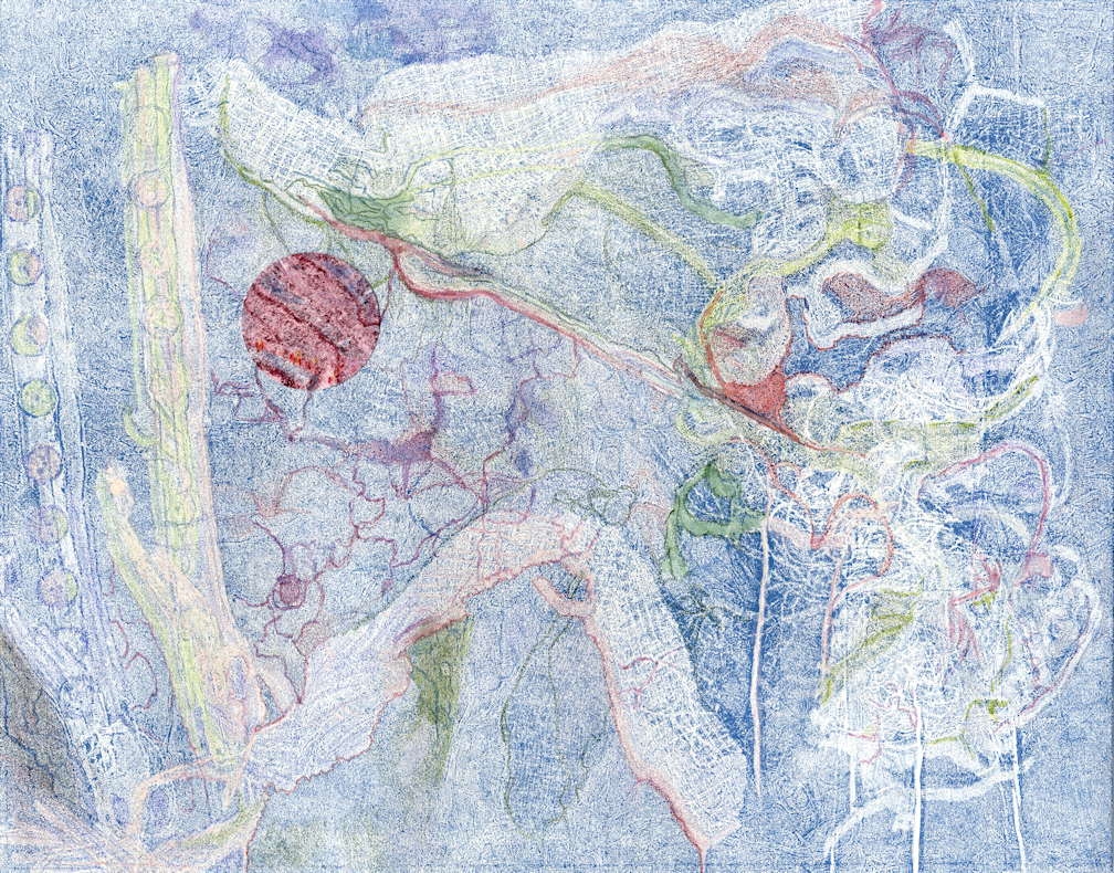

I transformed the orange ghost print on the right using watercolor paint. It now an abstracted landscape to my eyes, and I rather like it. These two pieces are fun examples of using ghost prints.
It is still rework time, so again with the collage and more… plus art burning has happened.
Today is the Solstice, and this provided a great opportunity for me to fire up a small pile of discarded prints, sketches, and copies of art work! I rolled up some 7 or 8 smaller batches of paper and taped them into fire starter “logs” for safe burning. Then I sacrificed these unwanted remnants of art to community on the neighborhood Solstice bonfire. Quite fun!
Meanwhile back at the studio several small older works are getting a bit of a cleanup, a digital variant, :
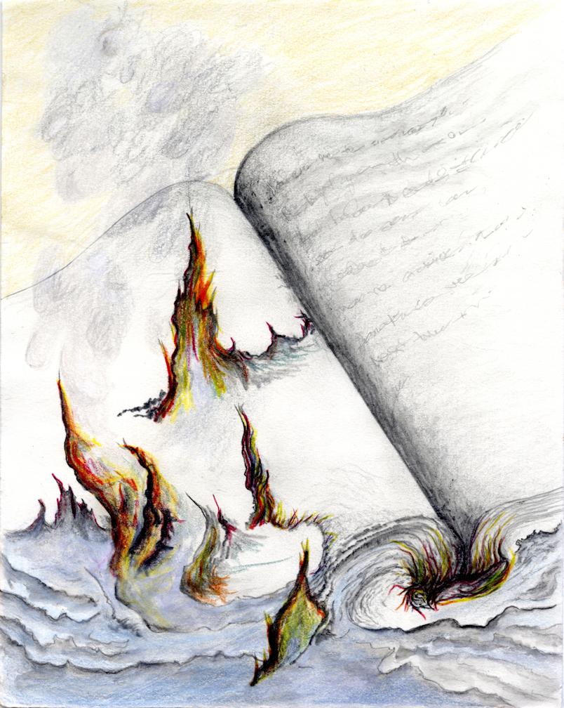
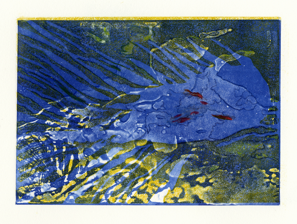
So above you can see what was once a Valentine’s Day collage for cats, now re-imagined for Solstice, and also now with a digital foil version. In the center is a pen & ink doodle that I rather like, with the digital foil below it. I finished up an incomplete drawing inspired by book burning, and added a few finishing details to a colorful blue water print from long ago. These are now stored in one of my new folios for safe keeping.
But yes, again with the collage. I have been creating holiday cards with bits and pieces of older artworks, using my paper cutters (straight and circular) to add layers to odd prints and sketches.
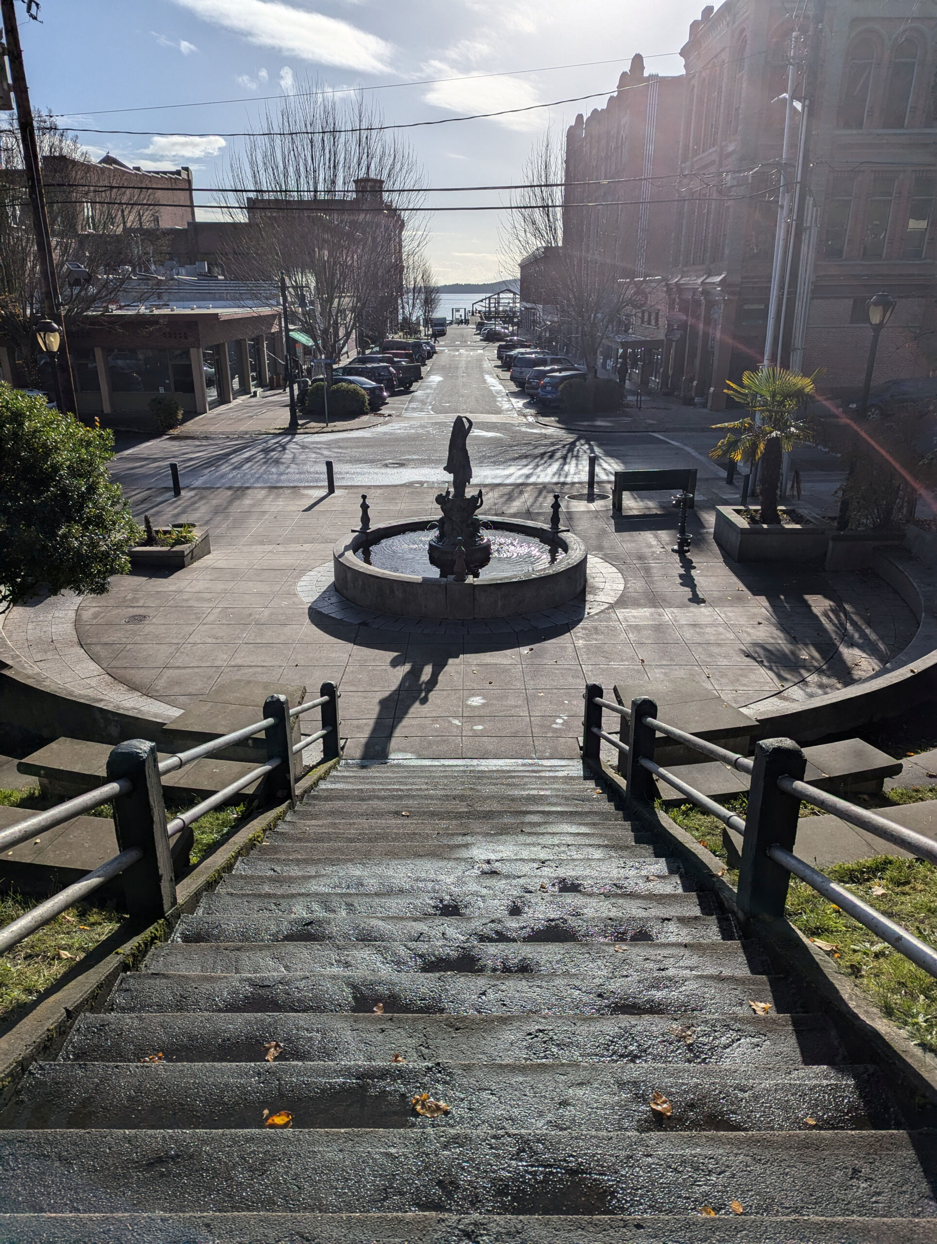
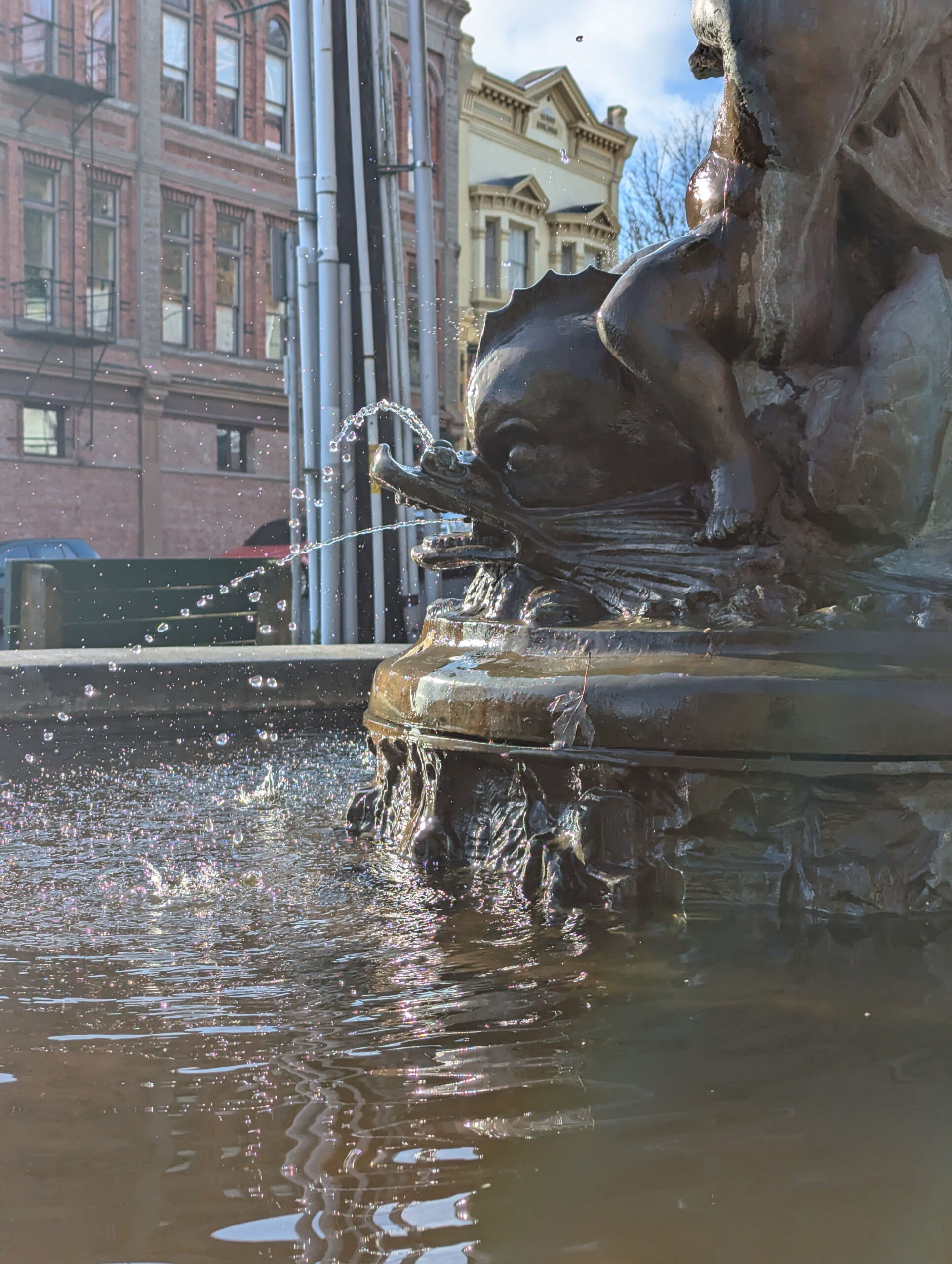
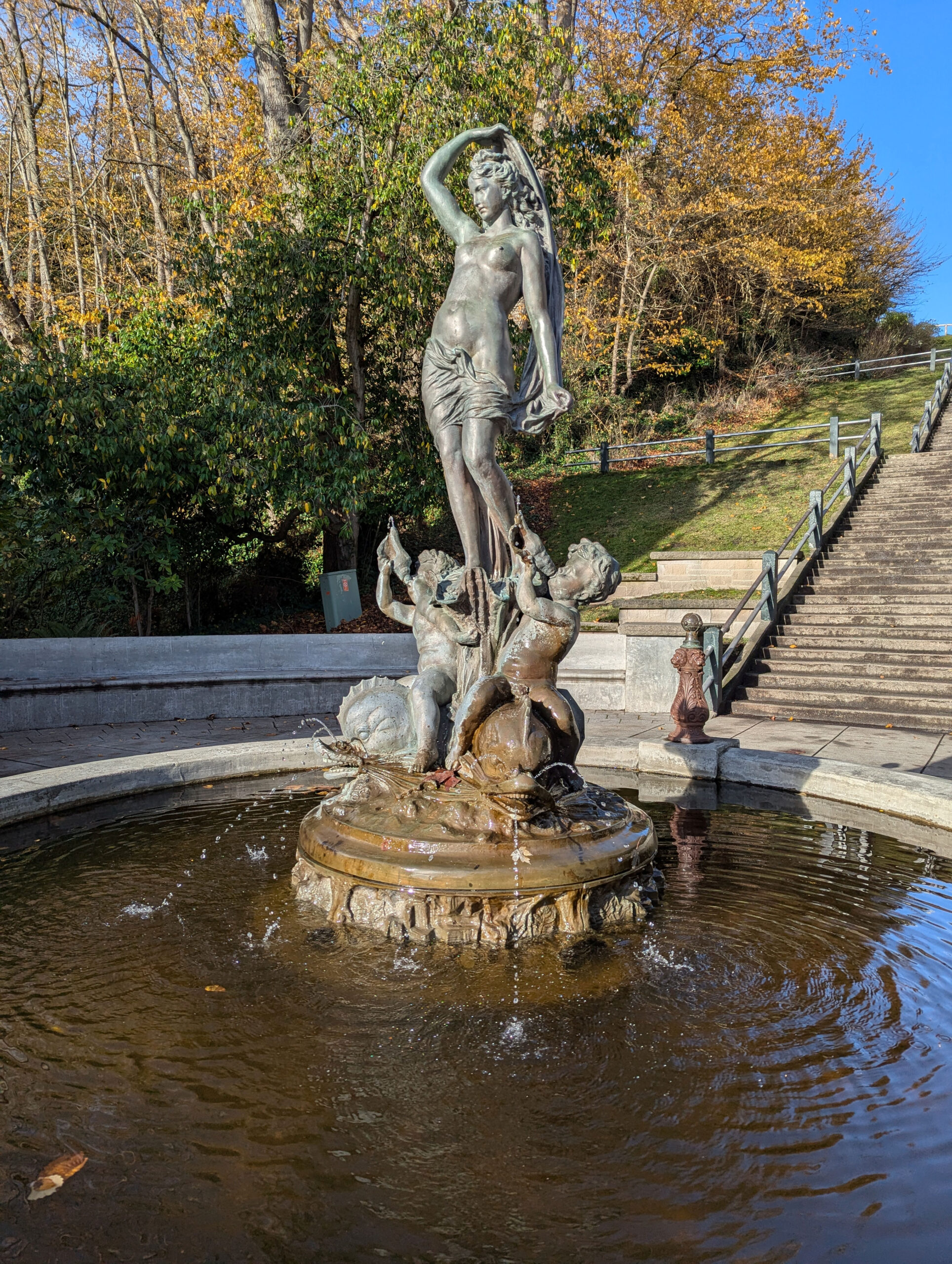
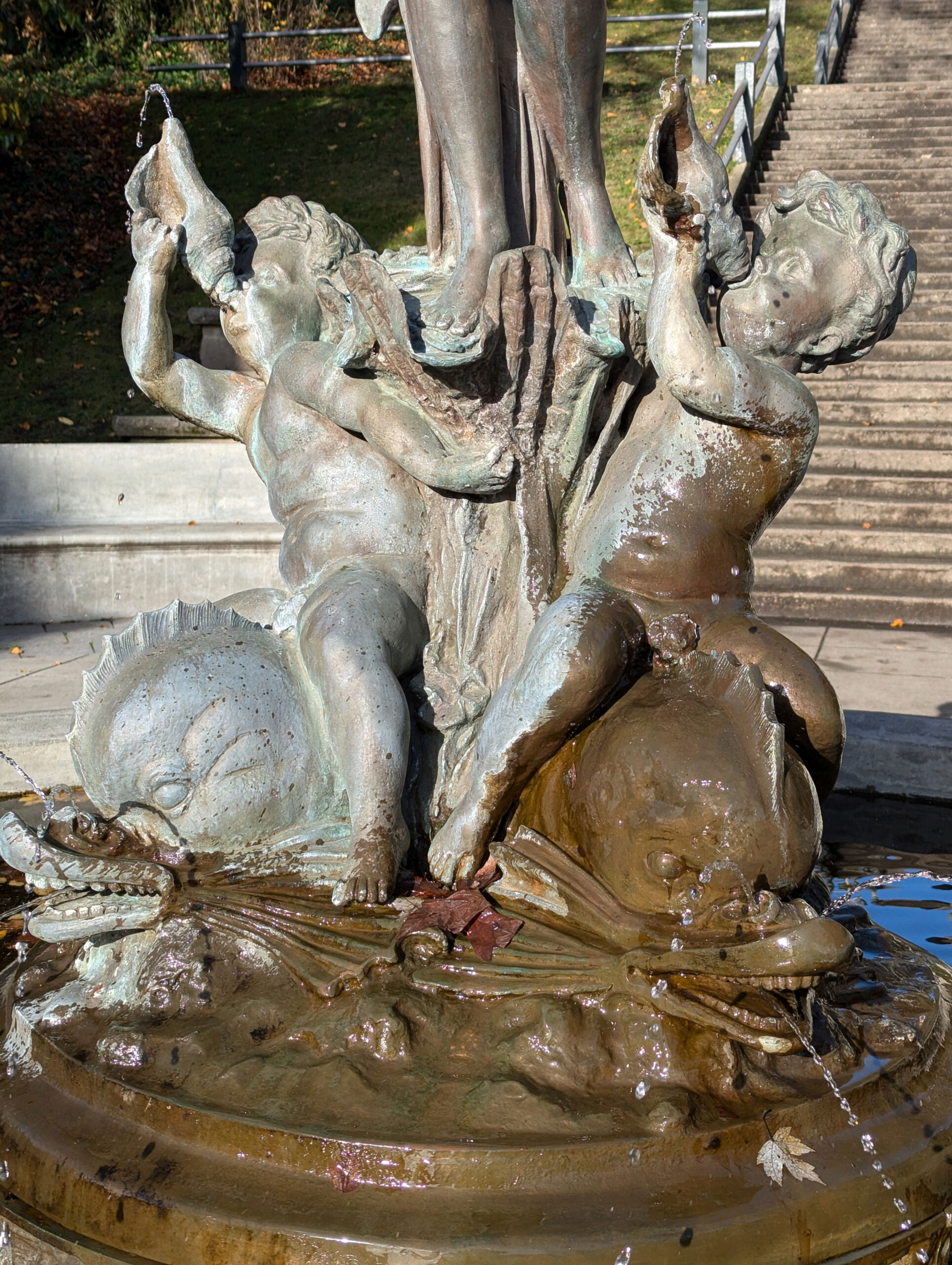
The Haller Fountain in downtown Port Townsend features a cast bronze figure pouring water from an urn. The woman stands on a ornate base with cherubs and dolphins also spouting water. The figure in this bronze fountain has been replaced three times. Time, water and vandals are hard on public art! The original fountain statue was of poor quality metal that did not last well.
The original for this figure, by an unknown artist, was based on the 1490s painting “The Birth of Venus” by Sandro Botticelli. The artist displayed the statue at the 1893 World Columbian Exposition, aka the 1893 World’s Fair in Chicago, Illinois. The Venus statue was shown in the German Pavilion. That statue was sold to J.L. Mott Foundry of New York, and casts could be ordered from their catalog with a choice of various bases.
Theodore Haller purchased the original figure from the Mott Foundry, and gifted the fountain to the City of Port Townsend in 1906 . Although the original statue was intended as a statue of Venus, our fountain figure is often referred to as Galatea. It seems that the donor’s father, Granville Haller, read a poem about the Greek sea nymph at the dedication of the gift to the City. Since then the figure has been known as Galatea. And the whole is also referred to as the Haller Fountain, after the donor. The first repair of the statue modified the original figure. However Port Townsend artists Mark Twain Stevenson and David Eisenhower created a replica of the first statue in 1992 after vandals destroyed the second statue.
In 2014 artist Sara Ybarra Lopez wrote and published a book, “Galatea: Heart of Port Townsend”. Sara included photos, art, and thoughts about the Haller Fountain by local residents. You can read more about the book in a Leader article by Jan Haliday. You may still be able to buy or view her book at the Jefferson Historical Society Museum of Art & History, at 540 Water Street.
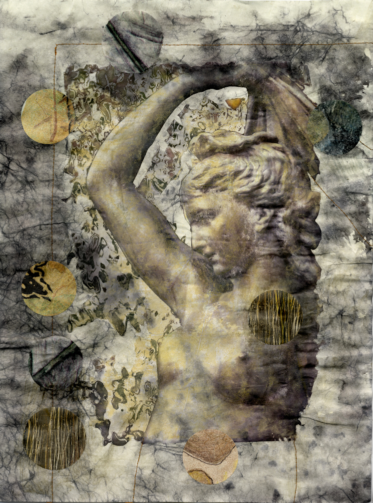
I used part of a old photo that I took of the Haller Fountain to create the recent collage displayed on the right. I added “bubbles” cut from some of my own prints. Galatea sometimes takes a bubble bath when pranksters add soap to the fountain water! I took several photos of the fountain in order to contribute art to Sara’s book.
I continue to file, finish, overwork? or discard older work that I am retrieving from my large flat file drawers. If you look, you can find so much art work badly stored, languishing out of sit and out of mind! My goal is to change this.
This change happens now. I continue to examine old work, with the intent to evaluate each and every item in my overstuffed drawers. The best work will move into the new portfolios for safer storage, but other work will move to my work table for new mods to old work. A few items will not make the cut, and I will add them to the discard pile on the floor. Oh, and my circle cutters will “chomp” on some of these “artworks”.


One significant change I have made to a number of old prints and drawings that I don’t love is “chomp” them up with my two circle cutters. I now have a lot of circles! I have previously used on LED light strings with some success. These look good when the lights are off, and add a bit of fun & color when the lights are turned on. Recently I have been using some of my many circles on or with unfinished work: ghost prints, scraps, or pieces that I just got bored with before finishing them. I am having fun, and even making some improvements…
Do these qualify as collage? Well that depends on who you ask!
Let me know if you enjoy any of my rework, or any of my blog posts!
Circles are my latest new mods to old work.
