

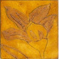
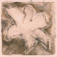
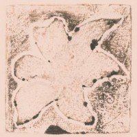
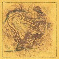
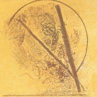
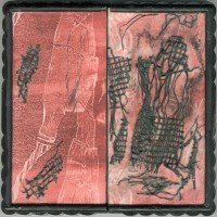
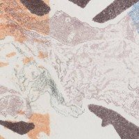
I am working with various low tech matboard 3″x3″ plates for a print exchange. I have made some 12 foil covered collagraph plates, and eight shellac over cut matboard plates, but have not yet printed all of them! The first six foil plates are too irregular and don’t quite please me: some are not square, and the relief is not enough: I have been working into all the prints with colored pencil. Love the yellow glow monoprint background with the red & green though.
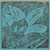
The shellac flower plates have been proofed without a press, last night in art class. Next to print them on the press!
Category Archives: About my art

Old prints & salvaged chess box…
I modified a portable chess game box that I found discarded without chess pieces to create this small reliquary. It is 2.5″ x 5″ x .75″ closed, & opens up flat to 5″ x 5″. Thought I was done with the first two images, but I could not leave well enough alone, so kept going. Not a big improvement, I am afraid!
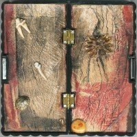
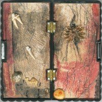
I replaced the chequered chess board outside pieces with sections of an enhanced monoprint, also used to line the inside of my box.Then I added the “artifacts” on the inside, which include found animal teeth, a shell, a stone, and an intricate seed pod. So now here is another of my personal “spirit boxes”: something of a small shrine. This one is small & portable enough to pack to take traveling :-). The magnetic latch & hard plastic will allow me to store a few small items safely inside: maybe a pair of earings?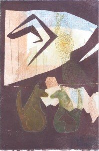
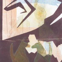
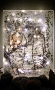
This is another more complete piece that started as a monoprint, now titled “Encounter”. I had no idea where this piece was going until I added one of the dog figures using a stencil made from contact paper… the piece took off from there, and I like it now. Not sure if these are feral or fully wild “dogs” 🙂
Upping the Ante: black is the new black
-

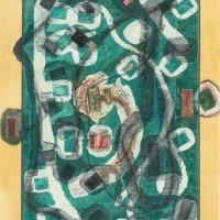
- A bit murky, but now presented a doubly hinged “card”
-

- Open the card to this, then use tab at right to open the “window”
-
- Now I love this one!
-
- Section I retouched
-
- Section II w/Additions
-
- Finishing touches & presentation for a 2010 monoprint
-
- Black is the New Black
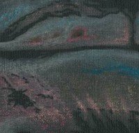
This is mostly about finishing… three older monoprints with more work, and #1 and #3 are newly cropped to feature bettter design, focus, or detail. The last reworked piece is pastel on black canvas, now given a color boost and the addition of blacker black!
Finishing up: presentation changes everything
Four linocut plates first printed in 2013 are the basis for this bones scroll. It may be finished now, but I am never quite sure … The print now has additional graphite paintings (of bones) top & bottom, and is presented in a corrugated & tasseled scroll “casing”. My painting “The Burden” has also had quite a bit more work, including added color and layers of gel medium, is now mounted onto 24″x24″ painted board. It can be hung as is, or considered ready for framing.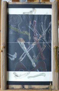

Mixed media & the Start of an Exorcism Series
 The finished work: after playing with some digital collages (prototypes for the design), I used my water soluble graphite stick & disk to paint in the dark ground and the tree & sky background.
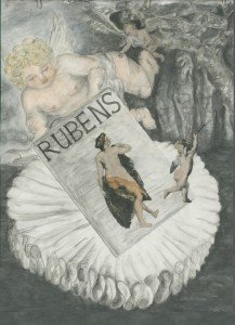
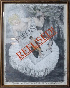
I had scanned a some images in the Rubens’ book, and isolated the three figures I wanted to use from the black & white photos of his paintings.
I sized these for my work, printed them, then added these using matte medium to my graphite painting, making this mixed media collage. Then I went to work with watercolors to tint the figures. I have left the background only partially tinted: just a hint of color.
I am amused, at least for today, and that is satisfying! And now I have framed this piece as if still on the drawing board, with the title: Rubens: An Exorcism via the Drawing Board. I have left in the paper clips, used acid free paper tape on the corners, etc. but all after carefully flattening out the paper, using framing spacers, etc.

The Rodin book with “Hand of God” drawing added (artistic license 🙂
Select the image to see the rest of the story….
The photo now added is the start of a new work based on another 1939 era art book by the same British publisher, George Allen & Unwin, LTD London. These books are hardbound with plain cloth covers, just the artist’s name in large letters across the very top, and the full name along the spine. They include some biographical material, but are largely made up of black & white photographs of work, with a few color plates. These belonged to my maternal grandfather, Robert Sivell.

Framed
On the drawing board …


I started this by looking at one of a set of art books belonging to my artist grandfather. I have had these for years. The books feature very famous artists, mostly “old masters” and are mainly in black & white, with only a few color plates. I don’t want to keep them, but don’t want to get rid of them either!
Perhaps this painting is something of an exorcism: maybe I will lay the ghosts of the “old masters” of realism, and also the ghost of my grandfather such that I can finally give away the box of art books that are stored up in my studio loft.
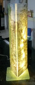
Just Sold: Grandparents Light
 Yay! I have sold this art light to a good friend & neighbor. The key was finding the right LED string. I needed plug in lights (not battery) that were not too bright, and not a 30′ long string for this small piece.
I found a 16′ string of LEDs on a dimmer that is a bit fussy to use, but works. The lights can be plugged in to a timer, and will retain the last setting used. This lets us ignore the many flashing modes, and determine the preferred brightness once and leave it alone!
I added a top cover, mounted the acrylic to a glass tile base, touched up and sealed the image, and it is delicate but stable enough to be functional (as well as fabulous of course :-).
The image is based on two overlaid images: a drawing inspired by a photograph of my maternal grandparents Bob & Belle, and a sketch of my granddaughter Fionna. The other two sides of this piece are displayed in previous posts.
Variations on lighting the Grandparents
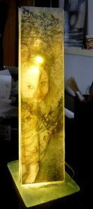 This is a new variation on a small light featuring my digital collage of drawings in mixed media using Inkpress backlight film. If I can find or make a working string of plug-in LED lights that is not too long & too bright, I can mount this piece onto the glass tile in a way that will be somewhat secure, though still quite fragile.
I found I had to add a color diffuser layer inside, around the LEDs, and touch up the color on the printed film for the saturation I want. I printed to the matte side of the film, which takes the ink beautifully, but is very matte/dull. For this light, I wanted a brighter more saturated look, so added watercolor and finished with gloss clear spray. It is now almost a satin finish …
The film I used is very stiff, and cannot be readily folded to wrap the corners of this 3-sided acrylic piece, although it could be wrapped around a cylindrical tube. It is not stiff enough to work without a support however. I have been experimenting with various transfer methods, all of which are problematic in one way or another (of course!). All require considerable additional remediation/enhancements to be satisfactory. Working with the lights is not easy: I cannot predict the clarity & saturation that will satisfy me and much trial & error with rework is needed.
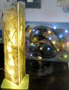
More with Lighting: another variant
This is another variant of a digital drawing collage. The two adult figures are my maternal grandparents: a drawing derived from a very lovely photograph of them together.
The child is a transfer of a poor likeness of a a portrait of my granddaughter (by marriage). The whole is 11″ x 14″, in an acrylic box frame backed by LED lights.
Sounds simple enough, but it took a LOT of work & rework to get this right. There is just enough color and light diffusion so the piece looks good lit and unlit, I think.
The plug in LED lights are very bright, and come in long strings. I have not experimented with shortening them for a bit less light, but I do want that option, especially for smaller pieces.
Ways of arranging…


This last piece is a toner transfer of a recent drawing, originally Aquarelle graphite on water color paper. I lost some of the tones & delicacy of the original drawing, but the transfer came out fairly well. I used Golden GAC 500 over a very smooth board. I lightly sanded the very old dry unknown finish on this scrap board, before applying medium. The sidebars are strips of a delicate pre-printed fine art paper applied with the same medium, then touched up with smudges of fine copper pigment.